3 Types of Forex Charts Most Used
There are three types of Forex charts commonly used by Forex traders when it comes to technical analysis:
-
Line chart;
-
Bar chart;
-
Candlestick chart.
In the following sub chapters below, we will explain each of the Forex chart type, and show you what is important to know about for each one.
What is a Forex Line Chart?
Line Chart:
The line chart is the simplest chart of all. As the name implies, it is a chart with a single line, which is drawn from one closing price to the next closing price.
The line chart above shows a simple and clear uncluttered line, which reflects the closing price of EURUSD on each day on the vertical axis and the dates on the horizontal axis.
What is a Forex Bar Chart?
The Bar chart also called “OHLC” charts is a little more complex than the line chart as it contains more information. It provides a series of many vertical lines known as bars. While the bottom of the vertical bar reflects the lowest traded price according to the time frame, the top of the bar shows the highest price paid. The right side of the bar chart shows the opening price while the left side indicates the closing price for the selected time period. Take note, when you see the word “bar” it refers to a single unit of data on a chart.
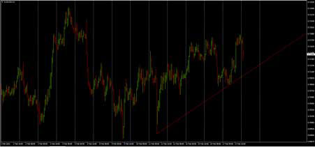
Moreover, if the closing price is higher than the opening price, it is then called a Bullish Bar. It becomes a Bearish Bar if the closing price becomes lower than the opening price.
What is a Forex Candlestick Chart?
This chart is created much like bar charts because it shows the same price information. The only difference is that it has an appealing graphic format. The candlesticks add dimension and colors to the Bar Chart so as to depict an area of the bar between the open and close as a two-dimensional real body.
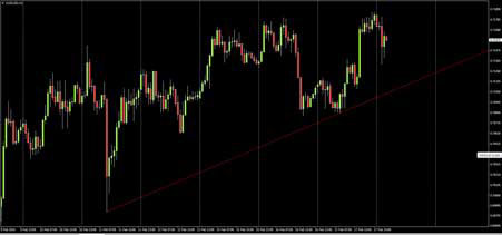
Candlesticks are comprised of a larger block (or body) which represents the difference between the opening and closing prices. An up candlestick occurs when the close is higher than the open while down candlesticks occur when the close is lower than the high. As you can see in the chart example above, up candlesticks are green whilst down candlesticks are red. However, if the open is equal to the close, then, there will not be a body, but just a line and this type of candle are referred to as a “Doji”. Nevertheless, if the colour of the real body shows white or green, it means that it is a Bullish Candle; meaning the closing price is higher than the opening price. But if the closing price is lower than the opening price, the colour of the real body will be black or red, meaning that it is a Bearish Candle.